Cireco Scotland
Scotland’s complete resource management
Introduction
Resource Efficient Solutions (Refsol) was established in 2014 and until recently concentrated solely on the provision of waste management services in Fife. Employing 200+ people, their growing yearly turnover is in excess of £35m.
Offering a broad list of waste services from commercial collection, management & processing, energy from waste services, skip hire to environmental consultancy, Refsol’s strategic commercial interests and scale had outgrown its brand and expanded its geographical reach throughout Scotland and therefore its operational ties to the Local Authority.
Client
Cireco Scotland
Industry
Environmental
Services
Naming, strategy, brand, web design
Visit

With significant recent investment in facilities, and to be better positioned in the market to compete for contracts against multi-national players including Biffa, Suez and Viridor, they came to Limegreentangerine to initiate a full rebranding programme, which began with establishing a new name.
Before & after
Building a brand platform
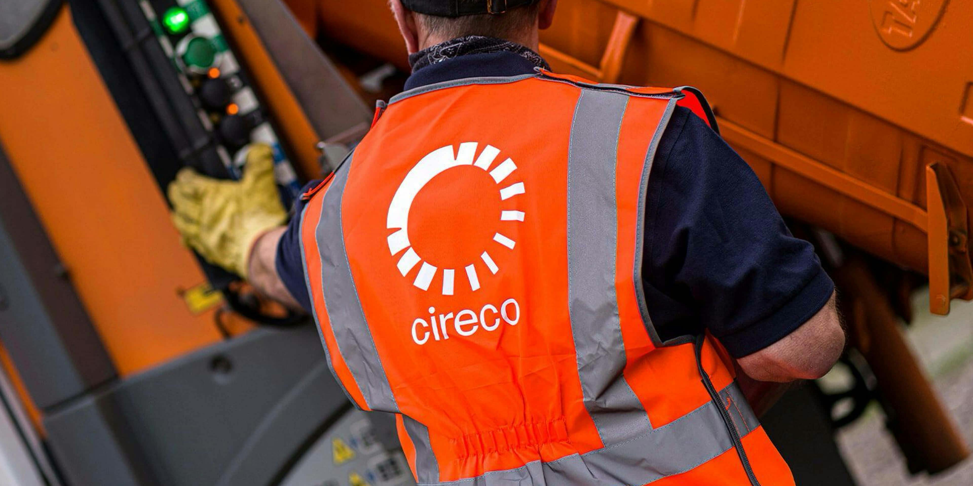
With an unrivalled infrastructure that includes three Materials Recovery Facilities, two landfill sites and substantial Energy from Waste capacity, Cireco are well placed to ensure optimal sustainability for their clients. With the processing facilities in place to ensure maximum recovery of all valuable resources, and have expanded their fleet to maximise opportunity across all service sectors.
NAMING
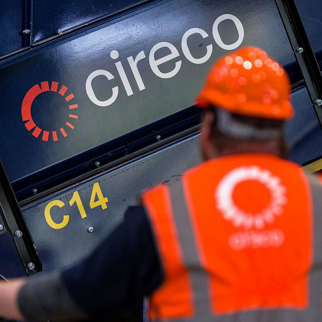
The goal, therefore, was to position the new company as Scotland’s number one, the ubiquitous name for complete resource management, known widely as providing expert solutions for waste and recycling. Working towards zero waste – or what’s known as a circular economy – to help Scotland create solutions to make the most of its resources. It seemed natural then, that the naming process would settle on this concept, and Cireco (cir~eco) was born.
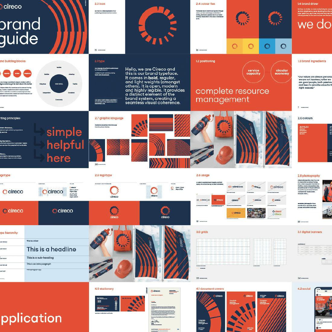
Reflecting this, the brand visual identity system is built around dynamic 3D shapes and objects which show a concord of elements and pathways, evolving and interacting in a natural way, both mirroring organic behaviors and adjusting to new developments.
In a combative market, many competitors ironically have historically sub-contracted many of their services to Refsol leading to some market confusion. This helped inform Cireco’s brand driver ‘we do more’ which speaks to swiftly educate as to the broad service gamut, unrivalled processing capacity and depth of services that Cireco are able to directly offer, all unmatched in Scotland. Similarly, it speaks of an ambition to do more with waste; always treating landfills as a last resort. Culturally, it helps shake off historic LA lassitude and externally illustrates an open, multi-faceted and willful structure.
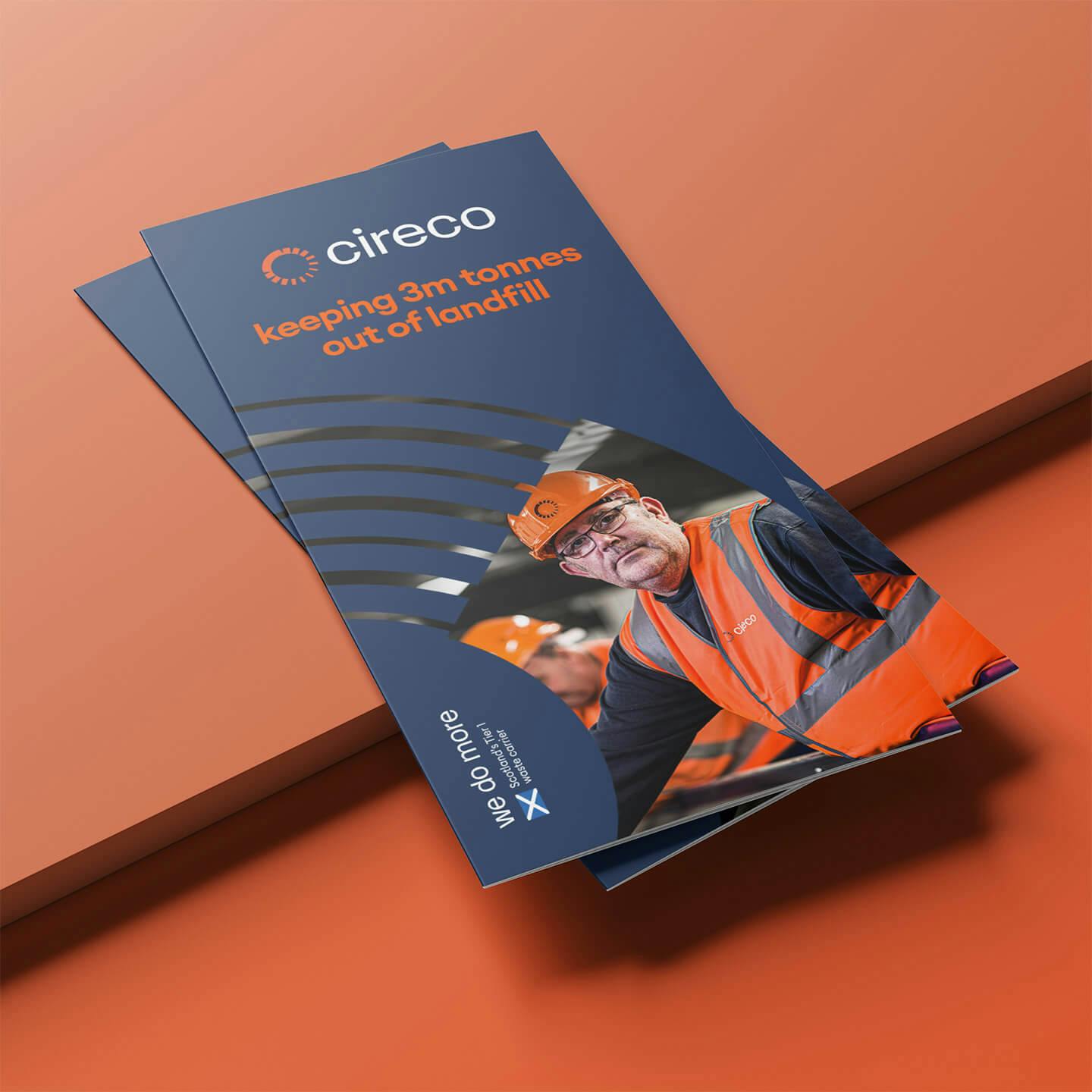
Unified system
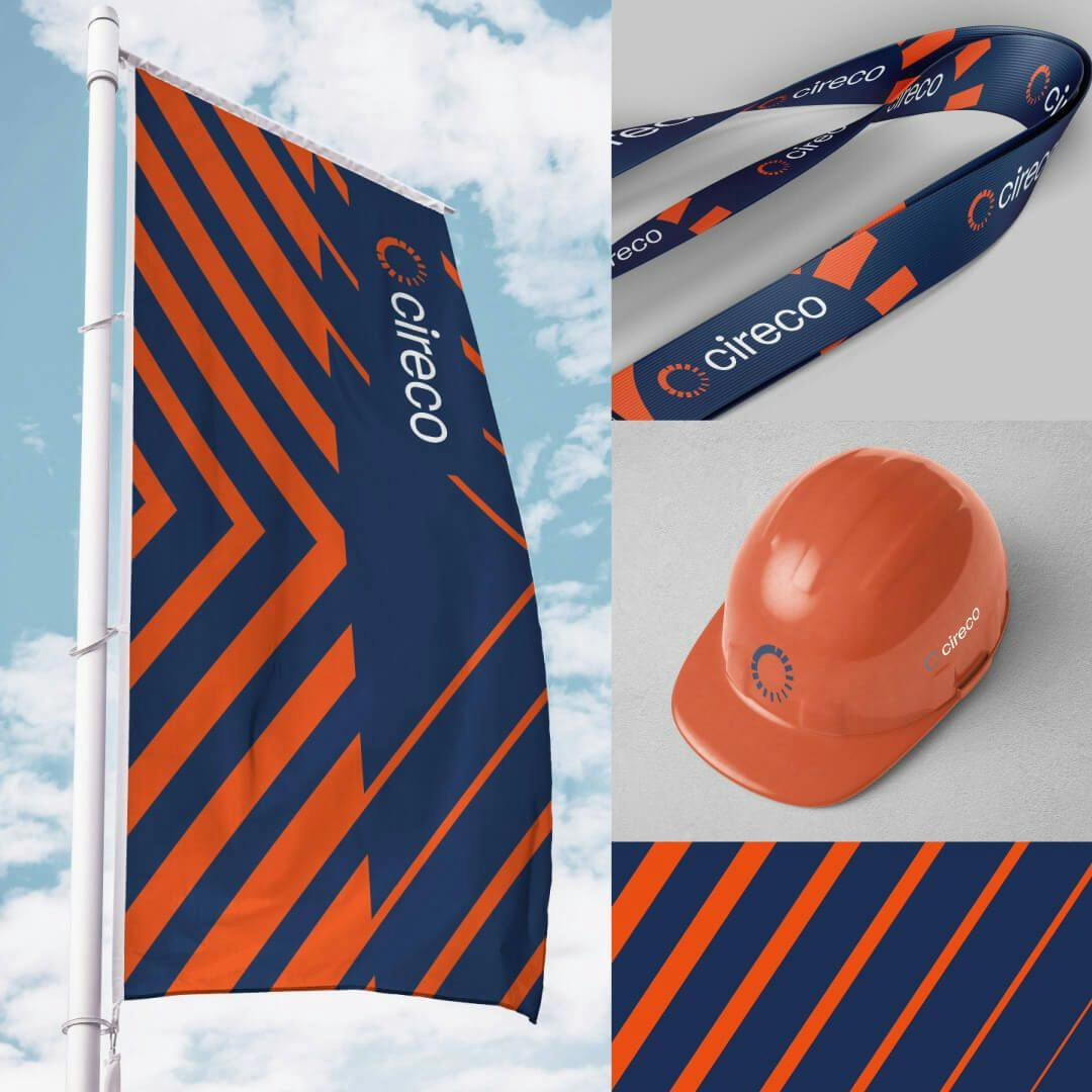
The creative brief was to create a unifying identity system that carries clarity of message, reflects and consolidates position as a market-leader whilst avoids industry tropes in order to create compelling stand-out. It needed to be appropriately utilitarian, but modern and accomplished, built flexibly but robustly — reflective of the company — weighted with a confident notion of scale and standard-bearing capability to create weight.
The identity leans into the circular concept, simply illustrating the perpetual cycle of waste to energy of regenerative waste management, and uniting the many service parts to the organisational structure. This visual expression informed the graphic language applied throughout the wider brand.

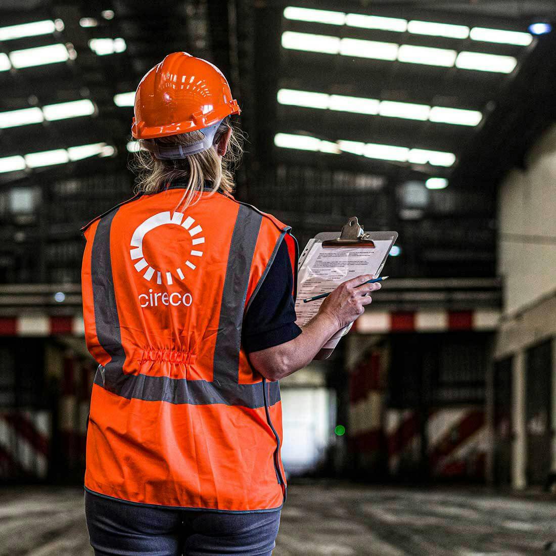

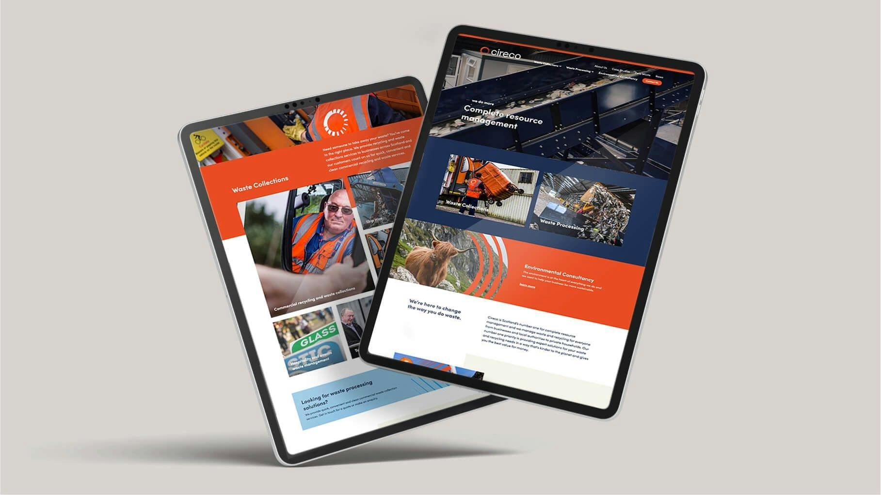
We are extremely proud of our new brand Cireco, it reflects the business’s ambition, investment, infrastructure and commitment to our corporate ethos of delivering a circular economy for Scotland.