Goleudy
Connecting people and homes

Introduction
Caer Las are a South Wales-based housing charity first formed 45 years ago to help prevent homelessness, provide housing, and create opportunities. They strive to create connections for people who experience homelessness, housing crisis, or trauma. Simply, their core purpose is simply to prevent homelessness and provide housing and opportunities. They seek to create connections for people who experience homelessness, housing crisis, or trauma. For people who have no home, they help get them housed and offer support in whatever way is needed to help them stay housed. And for people who may be at risk of becoming homeless, their job is to make sure that doesn’t happen.
As part of a strategic overhaul, they engaged Limegreentangerine to help introduce a new name and brand; Goleudy — Welsh for ‘lighthouse’.
Client
Goleudy
Industry
Charity
Services
Brand, animation

‘‘We exist for people who may be marginalised, suffer stigma, endure poor mental health, experience substance use or are leaving prison.’’
A beacon
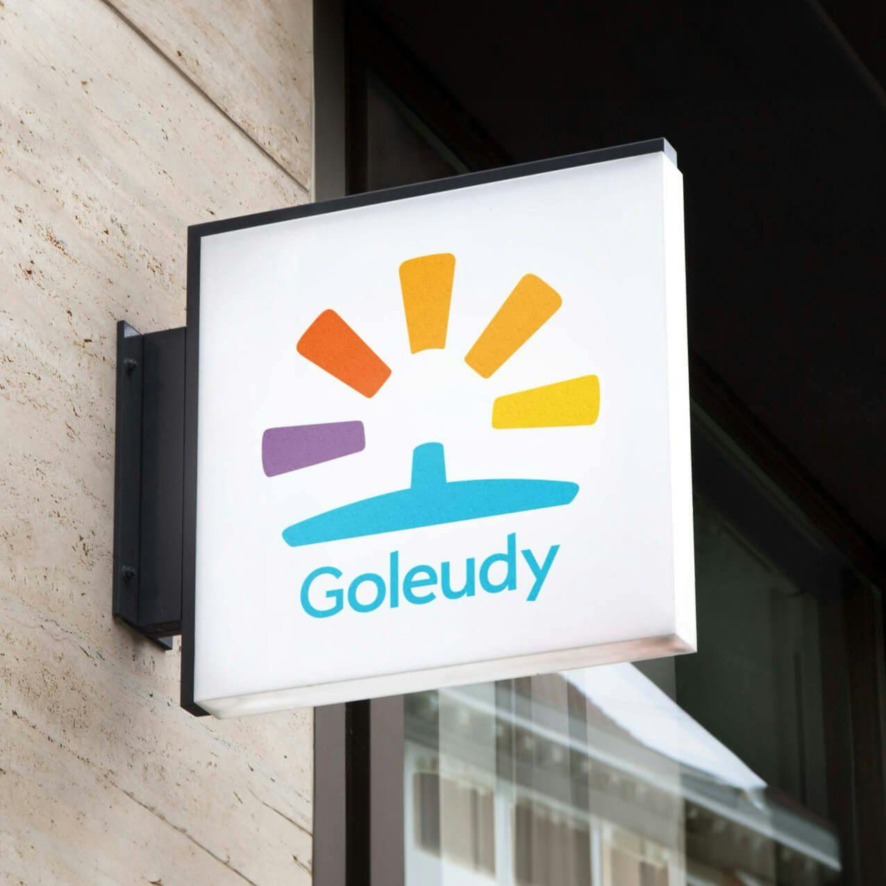
The new Goleudy icon is a visual representation of a lighthouse, or more aptly, a beacon. The negative space created by rays of light creates an identifiable house silhouette. This, combined with the colour palette going from dark to light, to convey a sense of movement from a dark place to light. The new identity is welcoming, affirming, and an uplifting reflection of the Goleudy’s purpose.


We’re really, really pleased with everything. The response has been brilliant and it will help lead us into an exciting new chapter.