Root & Ember
Luxury smoked food emporium
Introduction
Nestled in the heart of Bristol’s Clifton, Root & Ember is set to bring a new delicatessen experience to the area. This luxury food emporium is dedicated to provenance and sustainability, offering a unique blend of gourmet cured and smoked foods, along with locally sourced produce and artisanal pantry supplies.
Root & Ember approached us with a clear remit: to create a brand identity that would reflect their values of sustainability, local sourcing, and refined taste. However, they needed guidance on how to package this into a name and brand, while standing out in Bristol’s competitive food scene. Our task was to develop a brand name and visual identity that would evoke the richness of their products and emphasise their commitment to their artisanal craft.
Client
Root & Ember
Industry
Food & drink
Services
Naming, brand, illustration, packaging


Naming
We wanted a name that would speak to an artisanal, earthy soul, while also hinting at the modernity and passion the brand brings to the table. After several rounds of exploration, we landed on Root & Ember. The name embodies two key ideas: Root: Symbolising authenticity, heritage, and the brand’s dedication to local produce and sustainable practices. And Ember: Evoking warmth, craft, and the artistry behind their cured and smoked products.
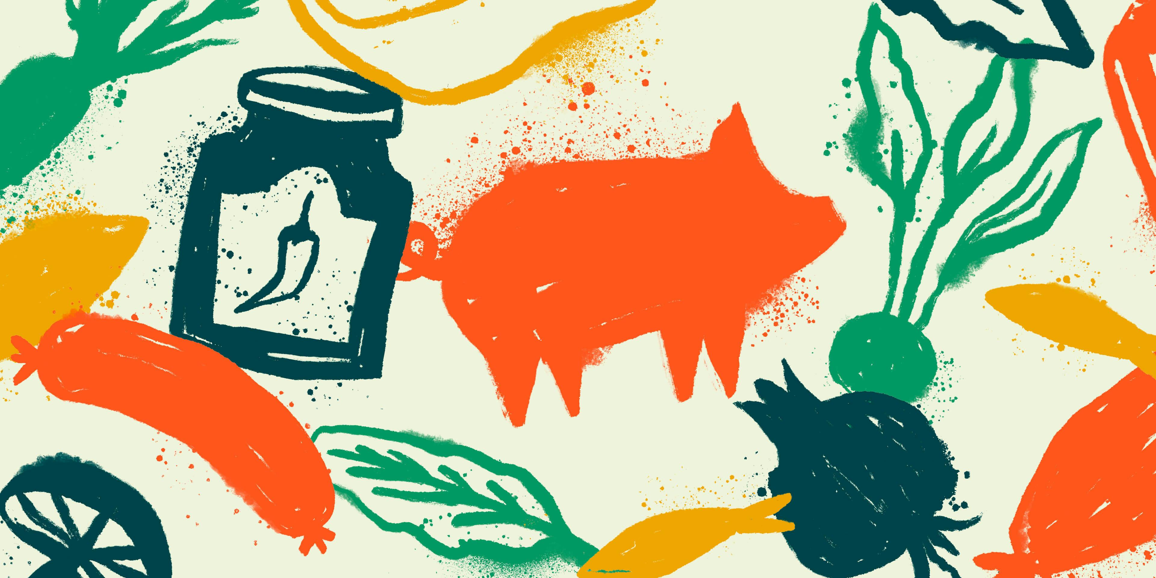
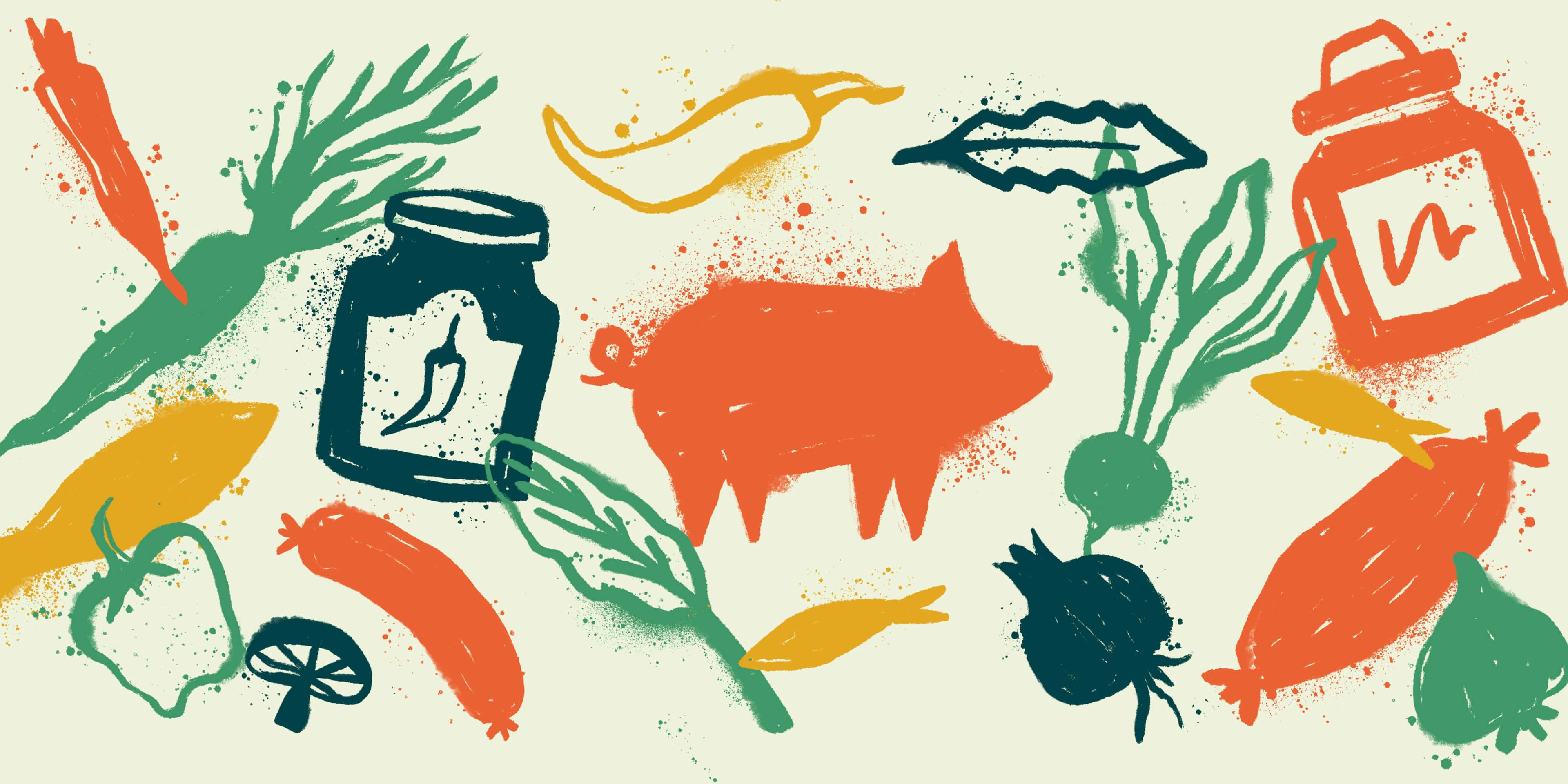
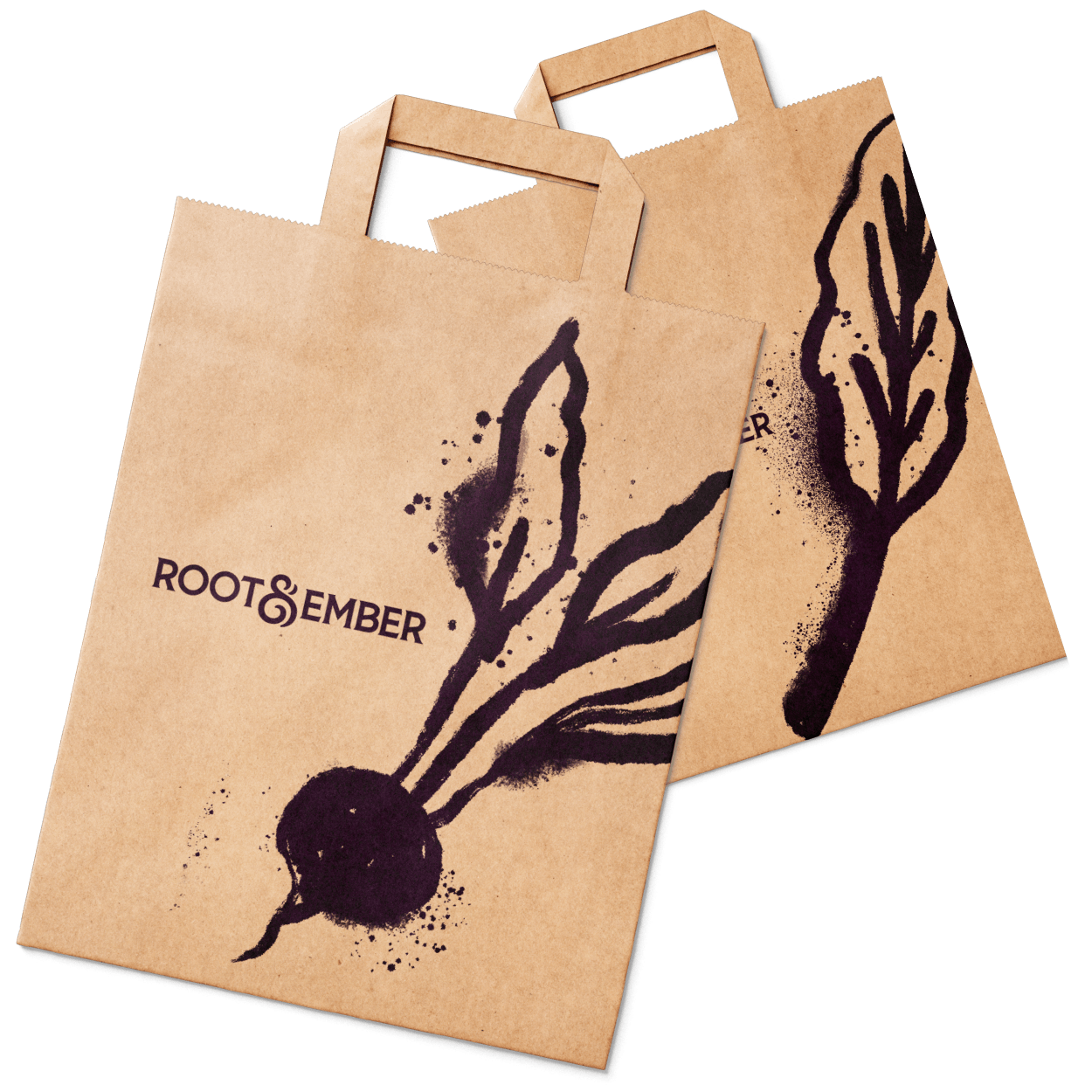
This pairing of words created a visually powerful springboard for the brand. Pairing ink-drawn illustrations to create natural, charcoal-y texture with a crisp logo mark that harmonises the relationship between growth and cooking.
A unifying symbol
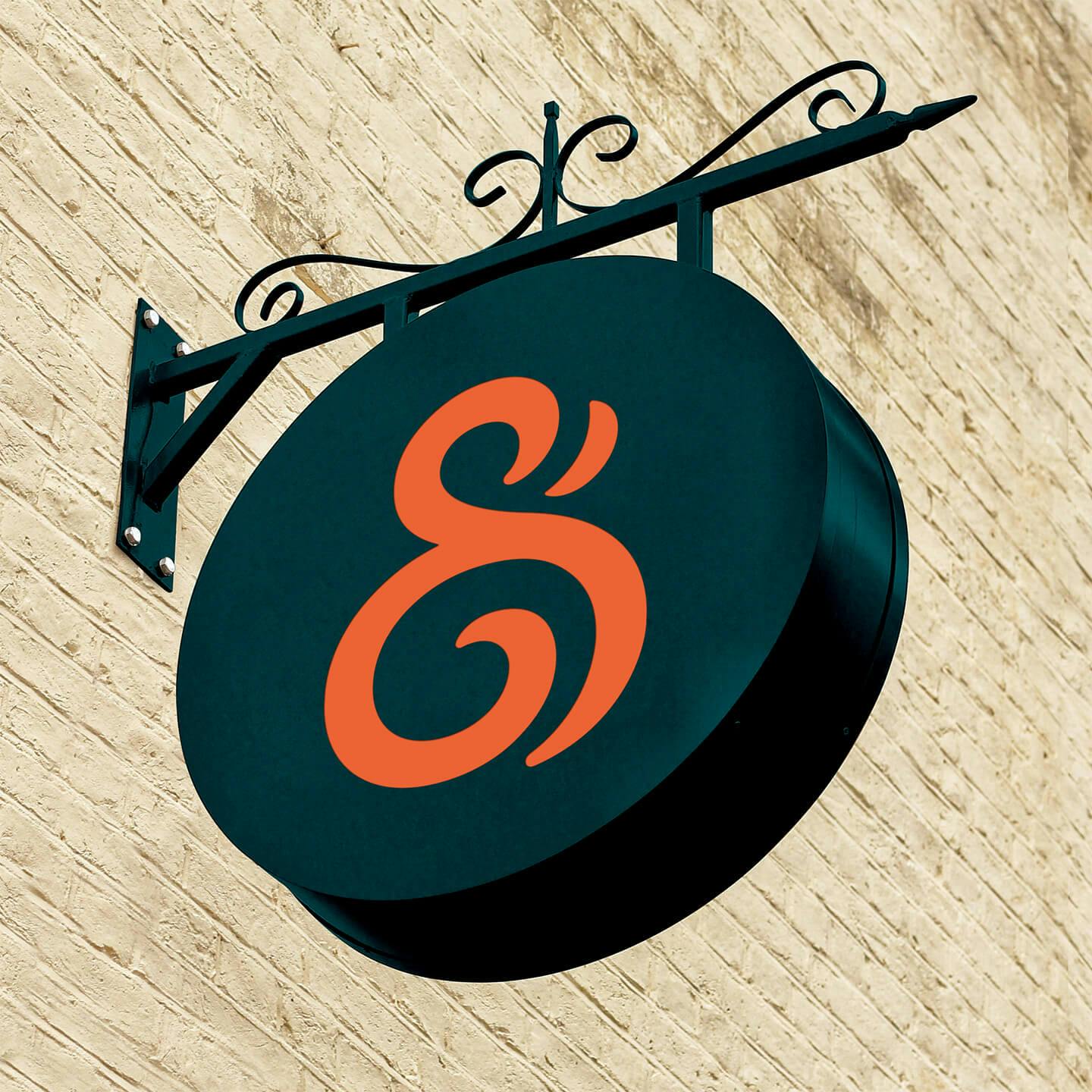
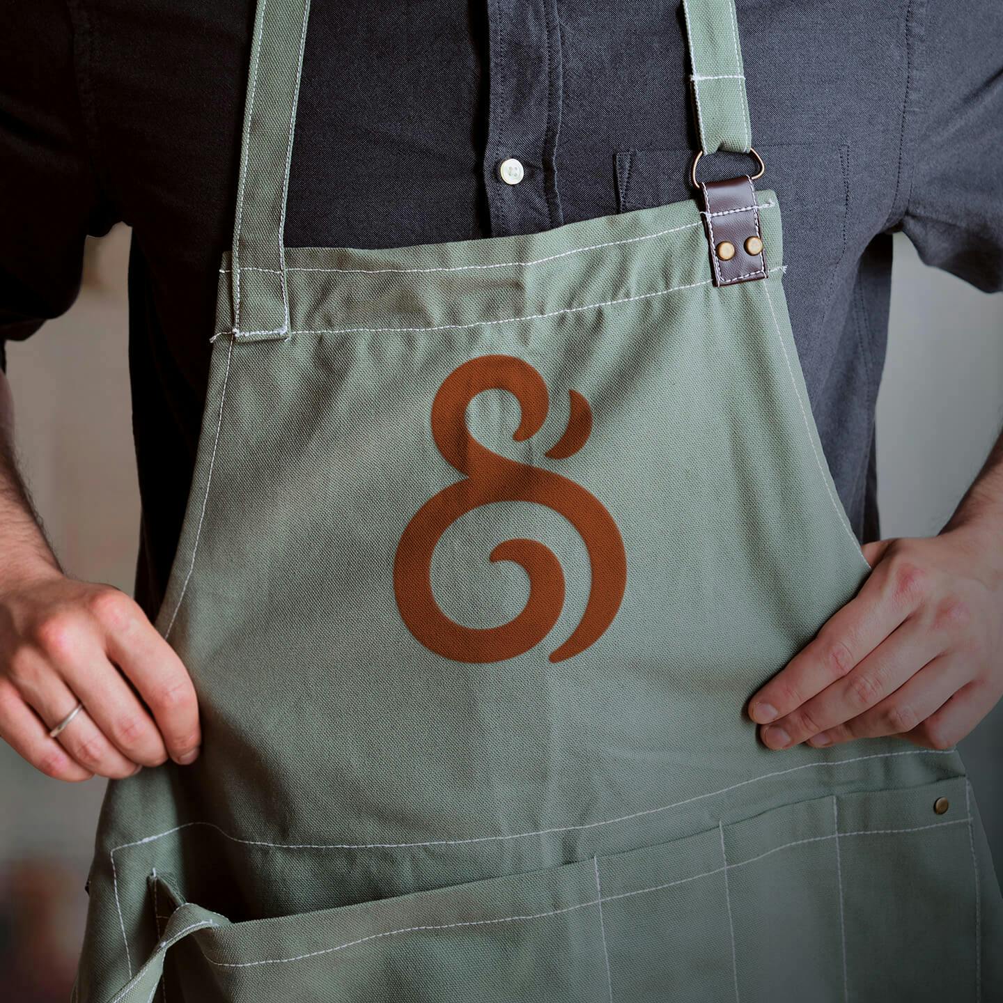
The logo itself incorporates a symbol that merges the concepts of growth (a shoot and a root) and transformation (a flame / ember), symbolising the produce’s journey from raw ingredients to refined delicacies.
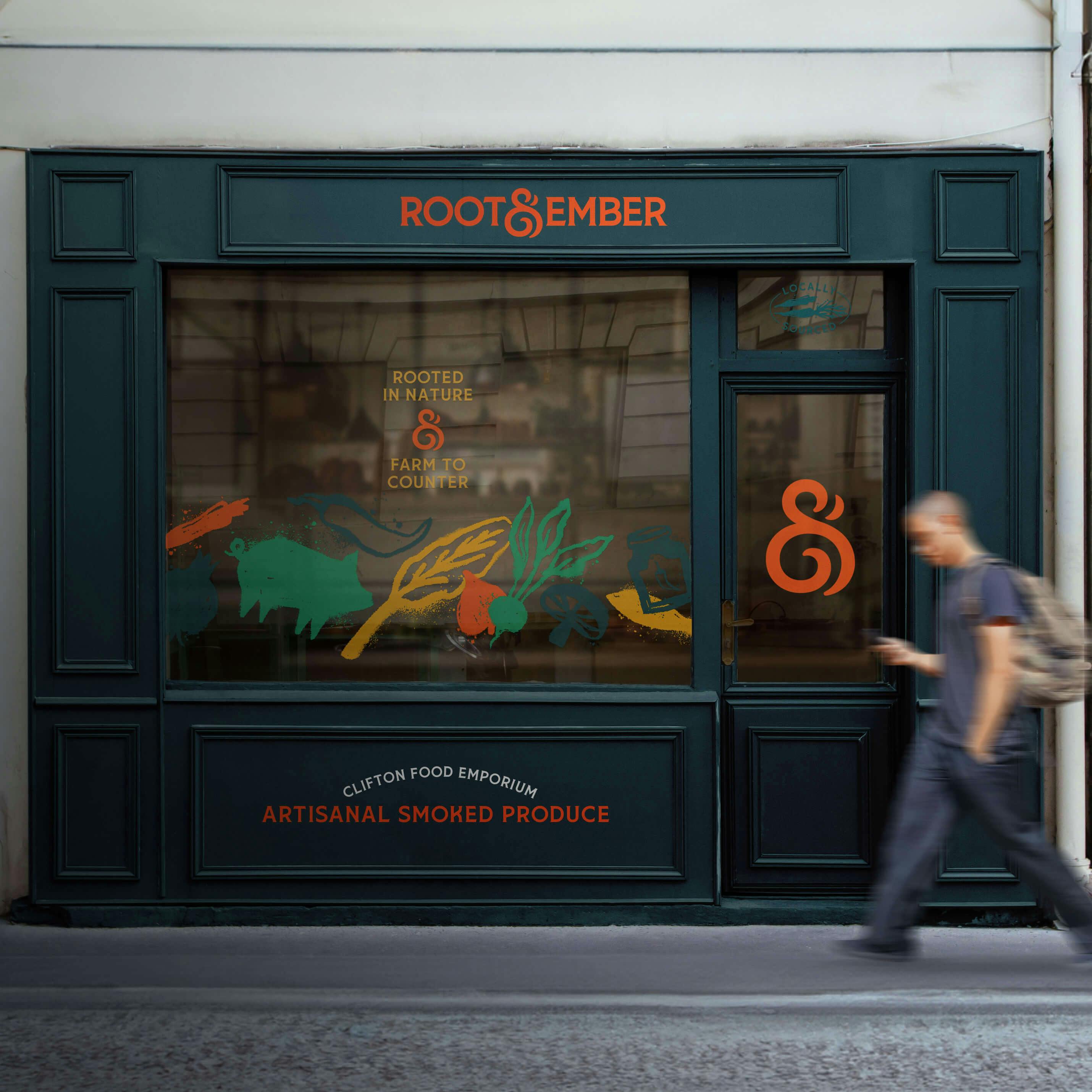
Typography plays a crucial role in the brand’s visual language. Storica, a modern serif font with subtle nods to tradition, pairs with earthy tones inspired by both nature and flame. The combination of these elements creates a versatile identity system that feels both classic and fresh.
With a name and look that perfectly reflects their offering on the up-market Bristol suburb high street, Root & Ember is well-positioned to become a beloved part of Bristol’s vibrant food scene.



We’re so pleased. Since the launch of the brand, Root & Ember has received a warm reception from the local community and beyond. Our branding is not only very striking but captures the values at the heart of what we’re trying to do as a business. Thank you.