Shape Fulfilment
Making easy ecommerce
Introduction
Fulfilment leaders 3PLUK processes in excess of 3.5 million units of stock each year from their network of distribution centres in the UK, Holland, and Australia. Despite continual YoY growth they were struggling to find real and memorable impact in a crowded market under the 3PLUK brand. As a result, they sought our expertise to address this issue.
Just like many in their sector, their existing brand felt antiquated and devoid of character. Consequently, the task was to formulate a new brand identity that better resonated with their business ethos, that spoke to their client’s needs more effectively, helping them to stand-out in a crowded market.
Client
Shape Fulfilment
Industry
Food & drink
Services
Naming, brand, illustration, packaging, web design
Visit
Customer-centric
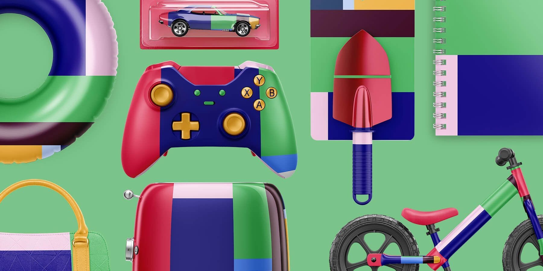
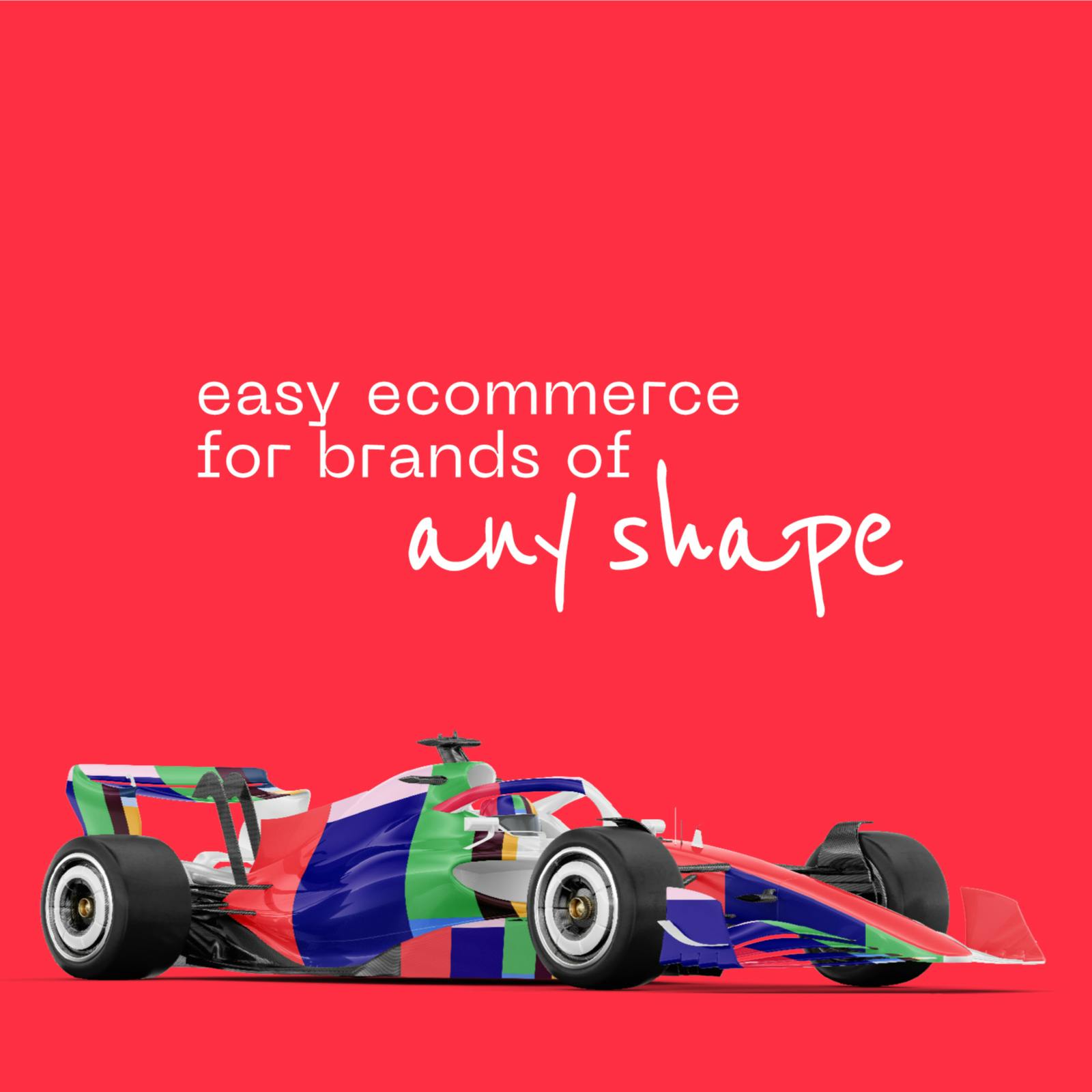
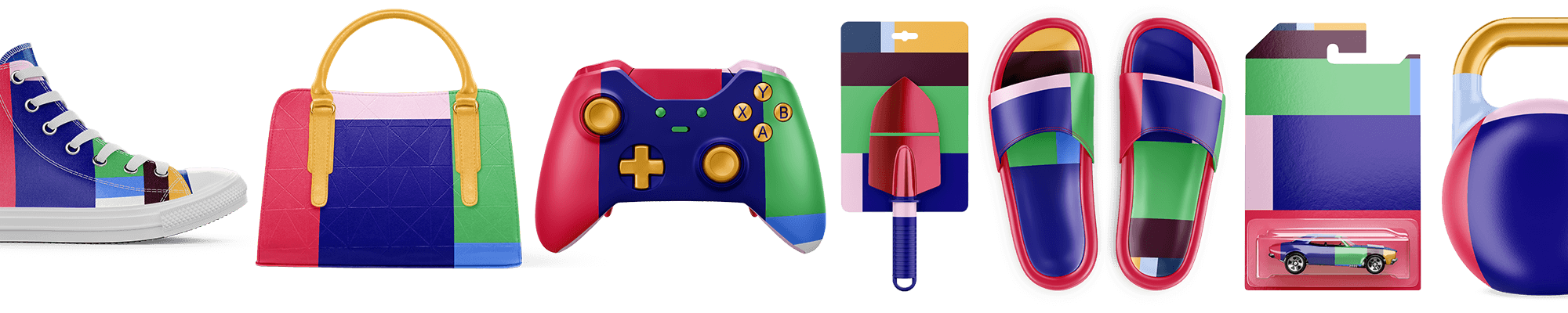
Derived from stacked shelves of ready-to-ship products in their distribution centres, the palette is used to create a warm tapestry of colour — a flexible, changeable and distinct system that becomes a primary brand tool. Whatever the complex e-commerce transportation, logistical, supply chain or storage problems, they’re there to help ship any shape.
CREATING A SENSORY EXPERIENCE
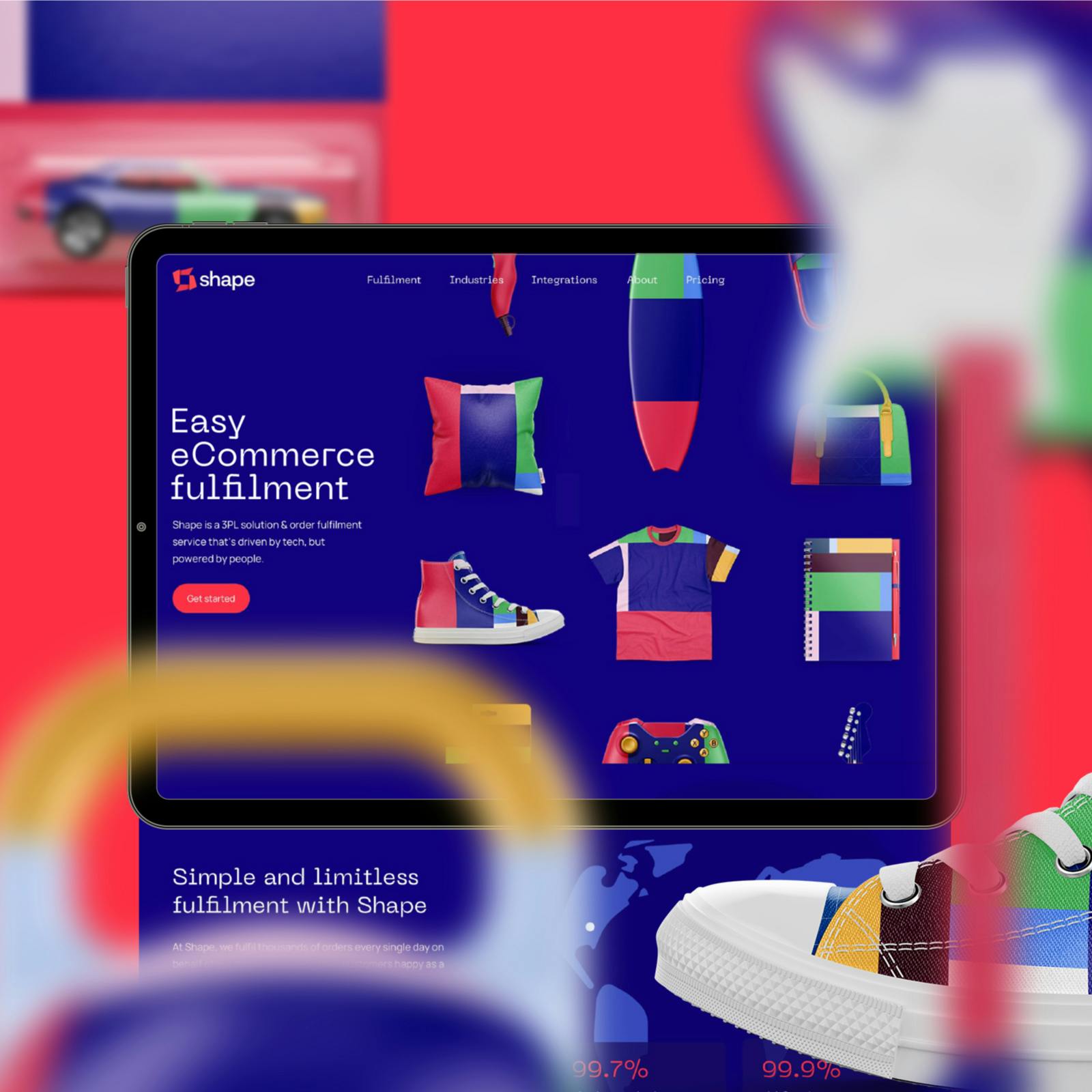
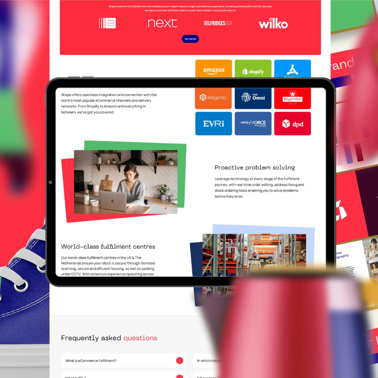
From warehouse to doorstep, clients use Shape to seamlessly fulfill tens of thousands of orders every day. The website needed to reflect this efficiency and volume, to place trust and reliability at the fore.
Product first
Our primary objective was to create a digital experience that resonated with Shape’s colourful and dynamic brand persona, clearly differentiating the business from competitors. This was achieved by shifting our focus from the norms of IT and the technicalities of automation to a more personable, customer-centric, approach that showcases customer’s menagerie of products and their stories.

Order not clutter
A content strategy exercise determined the necessity of three distinct sections: an explanation of the fulfilment process, a showcase of the industries the company serves, and a digestable presentation of the technical integrations provided by Shape. Secondary pages complement these sections, and strategically placed calls-to-action (CTAs) on each page guide new leads through a simple sales funnel.
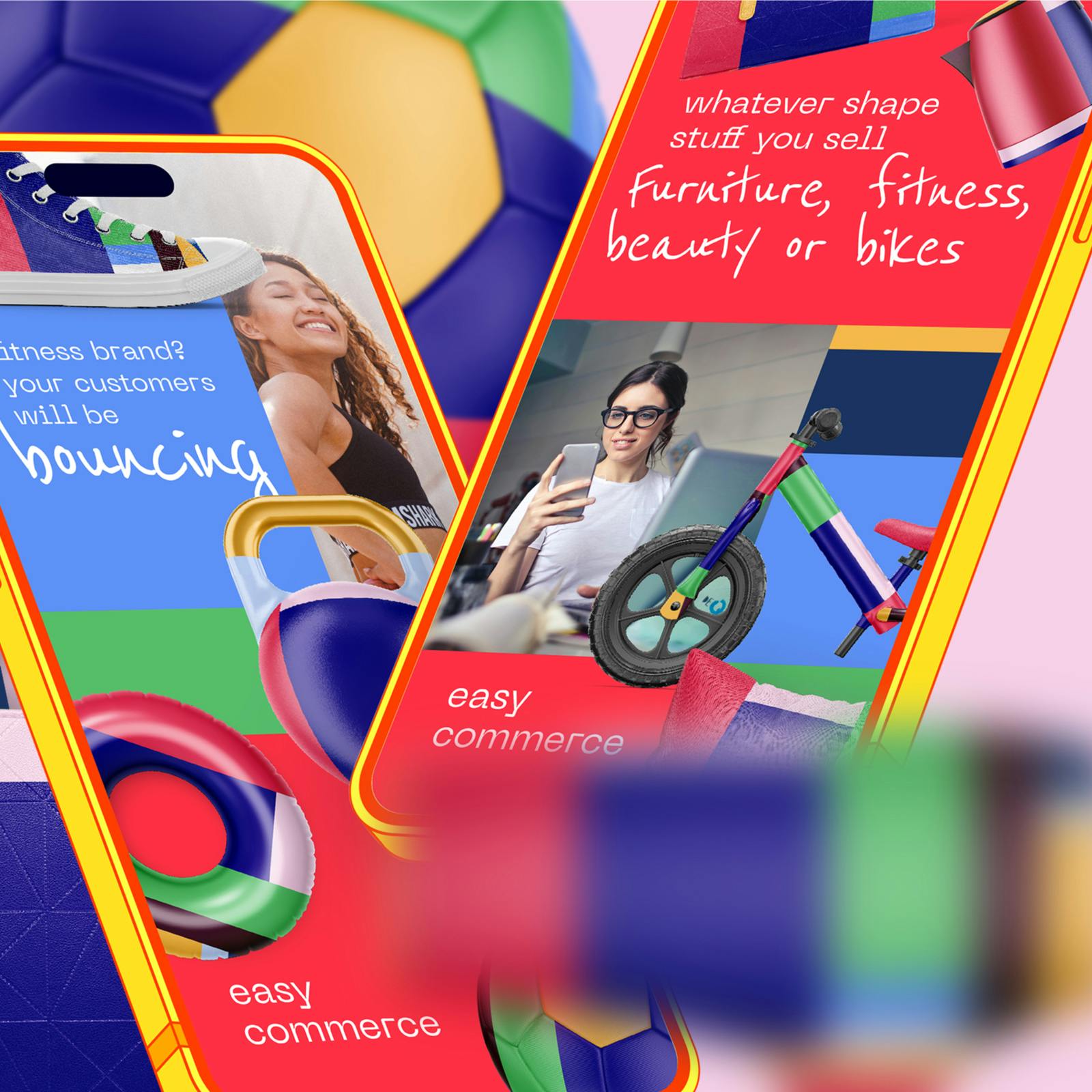
Optimised for mobile
For a B2B website with an equal mix of desktop and mobile users, we needed the Shape website to deliver a compelling experience across all screen sizes. Animated imagery and subtle transitions, combined with robust visual assets, ensure that all users have a pleasurable visitor experience from every landing page to success story.