Thornfalcon Winery & Press
Naturally inventive
Introduction
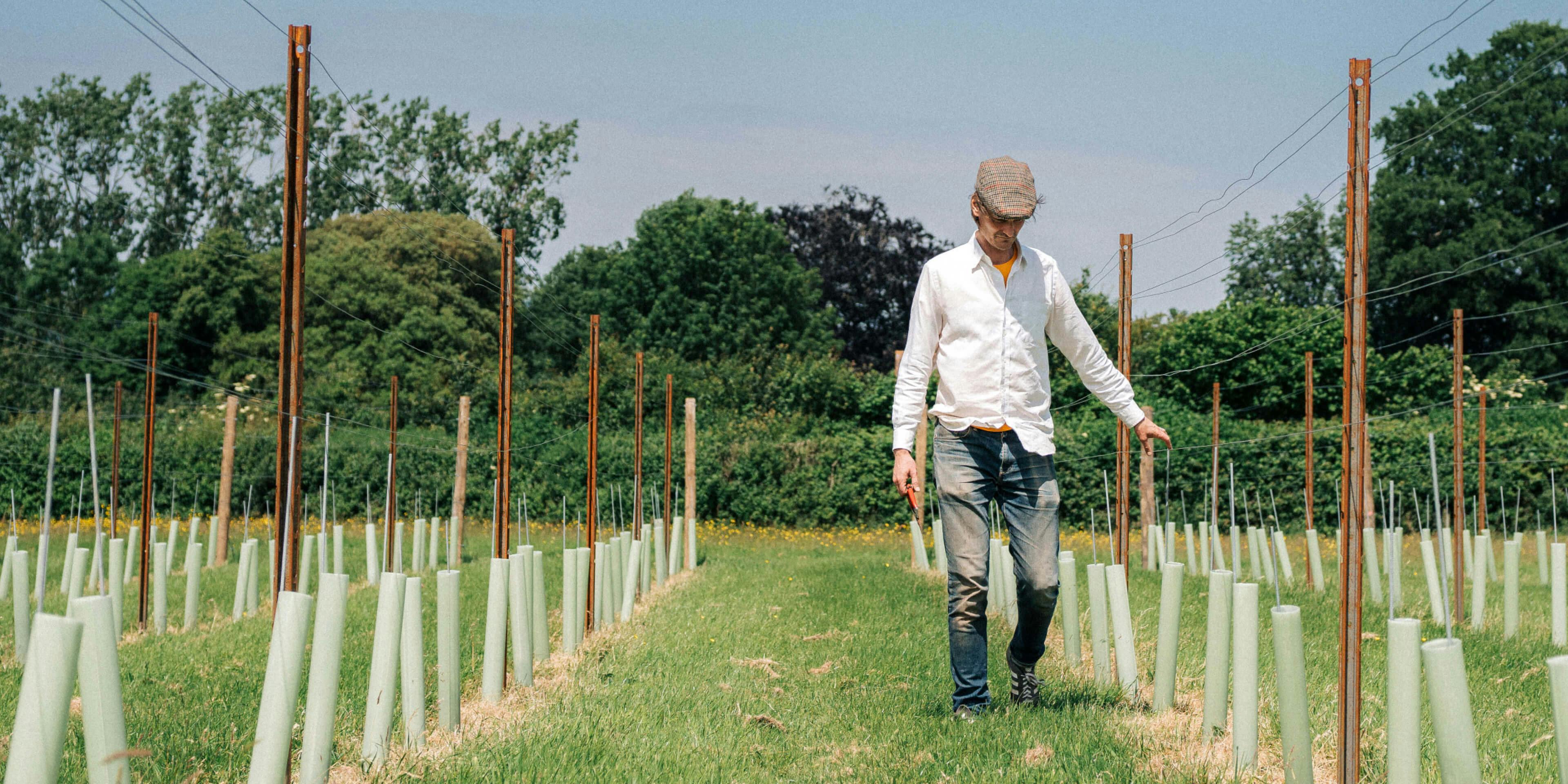
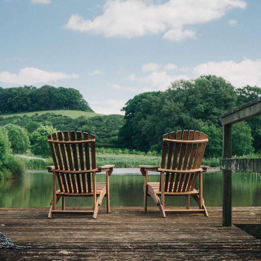
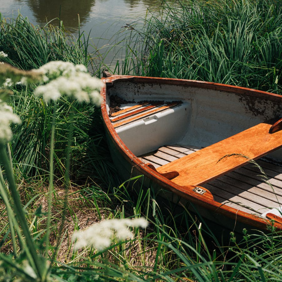
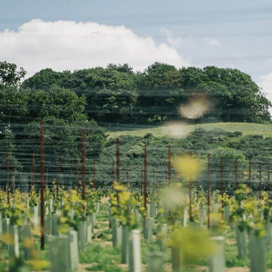
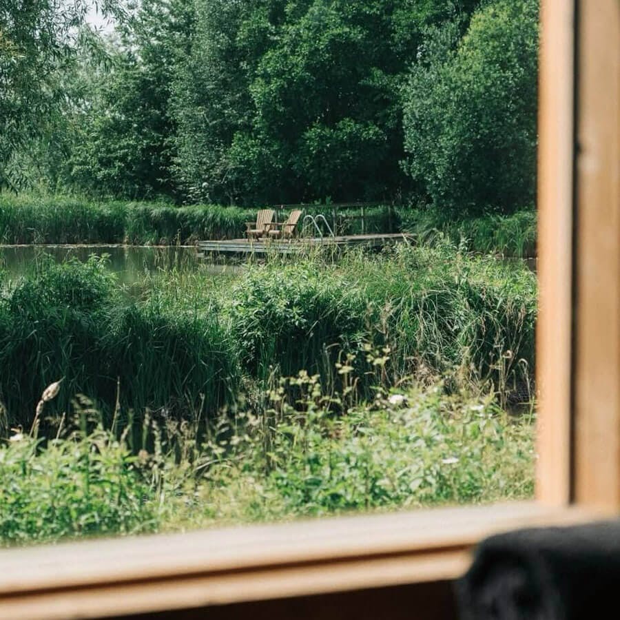
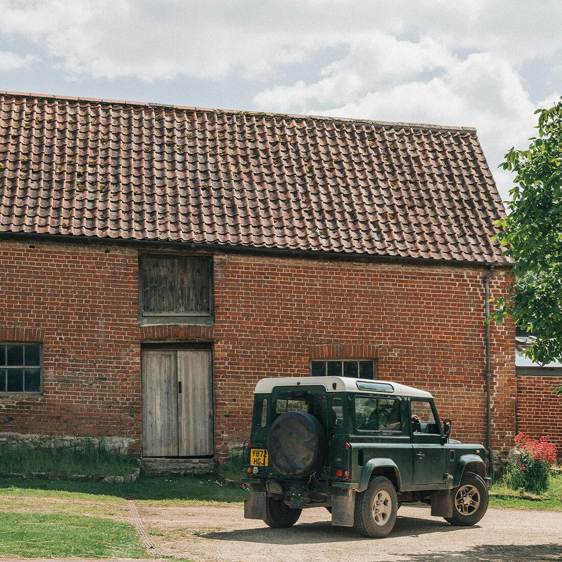
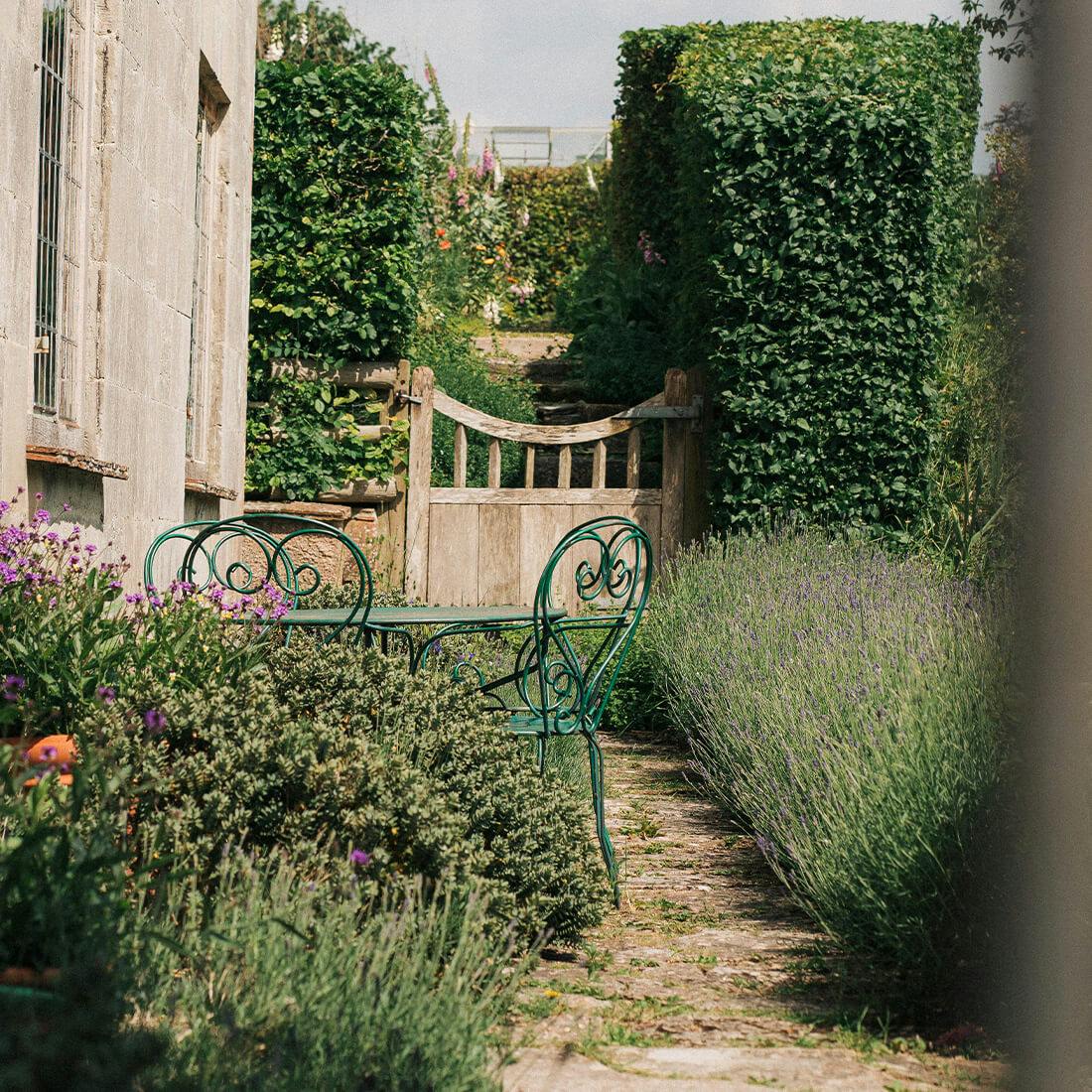
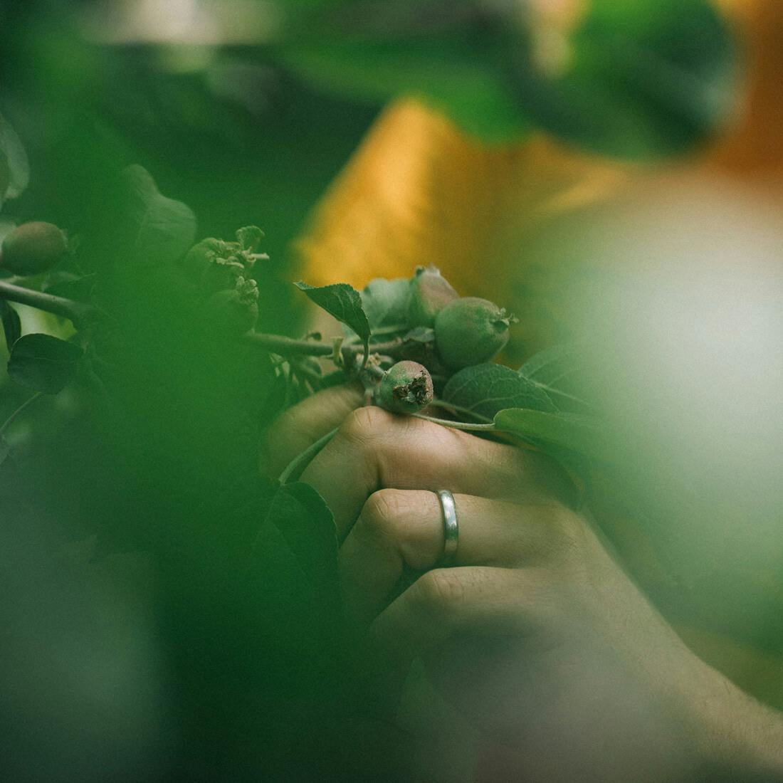
Thornfalcon Winery & Press is a farm in a magical corner of Somerset, with vineyards, orchards, a winery and cider press, a two-acre swimming and wildlife lake, woodland, a plentiful organic vegetable garden, a family of chickens, resident swans, and a bevvy of doves. The alchemy of flavour and the art of experience sit at the heart of Thornfalcon.
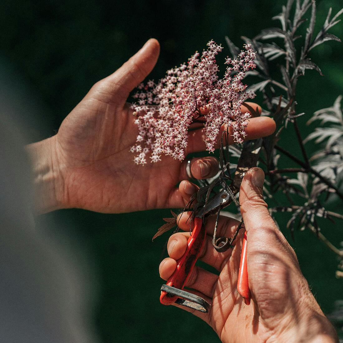
Everything there is grown, made, blended and curated by hand. They have a naturally inventive approach to farming and flavour creation, and are currently developing a range of boutique still and sparkling wines and bouche cider, to follow in 2025.
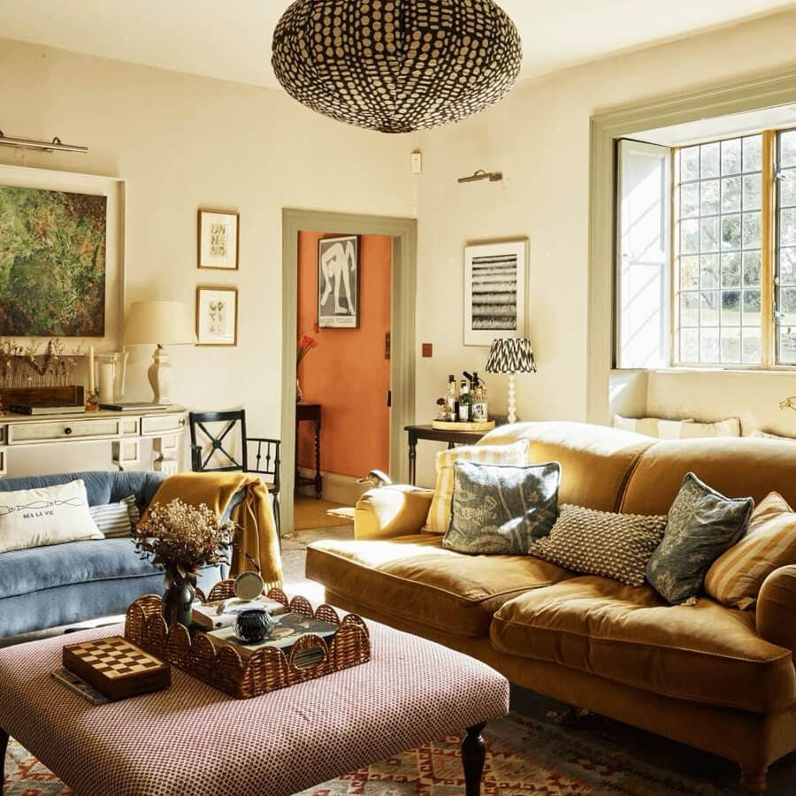
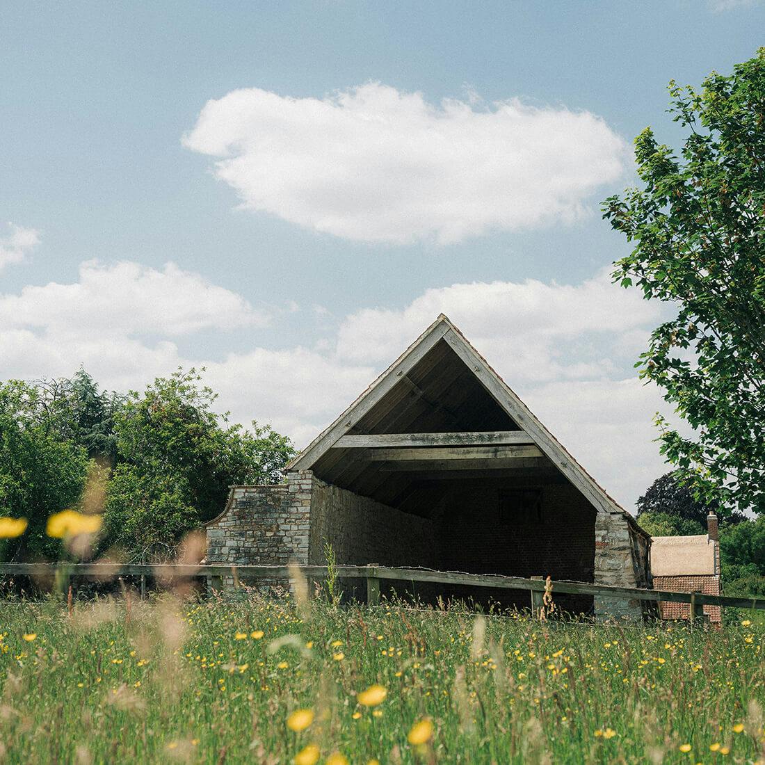
Thornfalcon Winery & Press is also an escape immersed in nature. Their Coach House is available to book, and two additional luxurious cabins will follow in spring 2025, as well as a range of experiences, tours and tastings from the summer. Sustainability and wildlife conservation sit at the heart of everything they do, with wildflower meadows, newly planted woodland, and nature corridors across the farm.
Client
Thornfalcon Winery & Press
Industry
Food & drink, hospitality
Services
Strategy, brand, illustration, packaging, website
Visit

‘‘Curiosity, skill and craft; creating vibrant and artful flavours from our small Somerset Estate. Through exploration and inspiration, everything we do is naturally inventive.’’
A place of natural invention
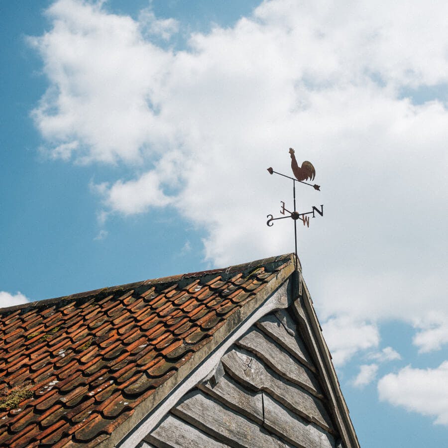
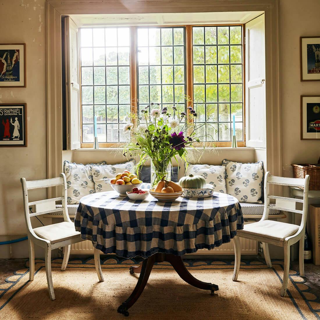
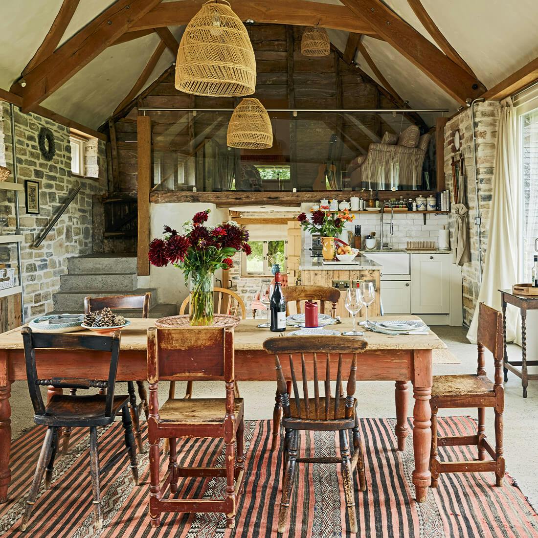
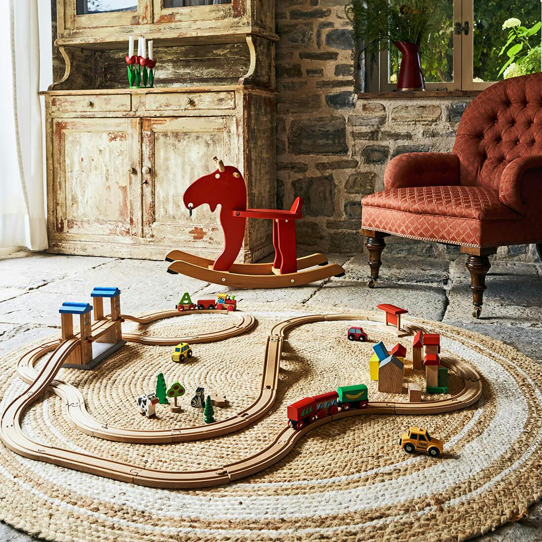
Thornfalcon is an ever-evolving setting to savour and celebrate wine, food, people, seasons, and place. We worked closely with Sophie and Panu to craft a brand that’s textured and sensorial, exploring rich imagery and craft associated with growing, making, great drink, great entertaining, and discovery of the Somerset good life.
The brand reflects natural roots, passion for flavour and the spirit of their magical setting. Built around the pillars of natural; curious; and crafted, we wrapped a strategy underpinned by their naturally inventive approach to flavour-making and estate building.


FROM THE LAND, BY HAND
The mark, a story of the estate, represents the beauty of our nature, wild landscapes, and the careful tending of both. Inspired by a ‘Sielulintu’ ~ Soul Bird from Panu’s native Finland folklore, the mark is made to create a sense of how activities and produce fit together in a vibrant ecosystem. A resonant stamp of quality, flavour and care watching over, and endorsing, the estate and production.


WHERE NATURE IS NURTURED
Naturally inventive, artfully crafted, and rooted in Somerset. The brand illustrations (a library of over 70, hand-drawn) are loose sketchbook-style scribbles; part of a wider narrative in a journal of the land, invention, flavour and craft. The colour palette, meanwhile, accents the soil, wine with a youthful, joyful vibe.
As the business, estate and products grow and develop, anchored in the many changing textures of the Estate, the brand features a palette of materials, textures and curated styles evoking changing seasons and different sides to the family of products. The estate is a patchwork of produce and activity — we lean into that.



There’s so much here that’s brilliant, characterful, original and creative. It looks gorgeous. We love the subtle good life vibes, and it’s been very well thought through. We’re super super happy with it, thank you!