Field notes: positioning
- Date 09 November
- Category Studio insights
- Author Alex
What is positioning vs a tagline, and why does it matter? A great tagline (/strapline) can make your brand memorable, but it takes a strong positioning to make it mean something.
It’s easy to spend weeks perfecting a tagline. Finding and testing the right words, rhythm, and idea that capture what your business stands. Something distinctive, memorable and instantly recognisable. But even the best tagline can only do so much.
If you want to build a brand that stands apart, commands attention and stays in people’s minds, you need to understand the difference between positioning and a tagline. Because while the two work together, they do very different jobs.
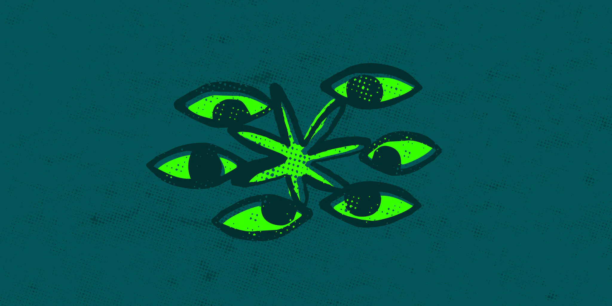
Think of your brand as a plant. Your tagline is the flower at the top. Both functional and decorative at the same time. It’s the visible expression of your brand: the line people see, hear, and (ideally) remember. But a flower isn’t what keeps a plant alive.
Beneath the surface are the roots. Less visible, but they give the plant its strength, stability and ability to grow. In branding, those roots are your positioning, from which your brand grows.
So, what does good brand positioning look like? Positioning is the space your brand occupies in people’s minds. It’s the meaning they attach to your business, the associations they make with it and, ultimately, a choice driver over alternatives.
A clever tagline might capture an ambition, a belief or a promise. But its real power comes from what people associate with it, and whether the brand consistently delivers on that idea. Your tagline tells people what you say; your positioning articulates who you are. Sometimes the two are expressed in the same words. Sometimes they differ.
One’s an accent; the other is a language.
At Limegreentangerine, we believe strong brands start with clarity and simplicity. We put a lot of time into finding and developing the central big idea that sets you apart. We focus on what makes your business different, what it means to your customers, and how that difference can become something distinctive and valuable, captured in a line or phrase that enables everyone to ‘get it’.
Our work with Sunrise Beverages is a good example. In a market dominated by major players, Sunrise needed a clear point of difference: a way to champion independent brewing, build a future-facing business, and give its portfolio of breweries room to shine.
Together, we developed a brand strategy built around authenticity, uncompromised quality and growth without sacrificing soul. At the heart of it was a simple, ambitious positioning: Brands on the Rise.
More than a catchy line, it captured the momentum behind Sunrise, its portfolio and the next generation of standout drink brands. It gave the business a clear strategic direction and a David vs Goliath attitude, which we then translated into a visual identity designed to balance confidence with care, and ambition with authenticity and quality.

That’s the difference between finding a phrase that sounds good and defining an idea that gives a brand somewhere to go. You can’t build positioning with words alone. This is where many brands get stuck.
They invest time in finding the perfect big idea, expecting a clever line alone to make them distinctive. But if it’s simply tacked on, and the experience, communication and behaviours of the brand don’t support that idea, the words quickly lose their power. Positioning isn’t something you can simply declare. It’s earned.
It develops when people repeatedly encounter the same clear idea across every interaction with your brand. Your website, visual identity, customer service, products, campaigns and the way your people behave all contribute to the picture people form with clarity and cohesion.
For Cyfarthfa Castle & Park, ‘A Castle, A Catalyst’ informs the organisation’s point of view and its stature. It’s not a public-facing line, but it guides how the brand shows up and its choices. Likewise, Thornfalcon’s ‘Naturally Inventive’ mantra; Axiom’s ‘Make Possible’; or how Copper Horse both claim to and deliver upon ‘Setting the Standards in Cyber.’
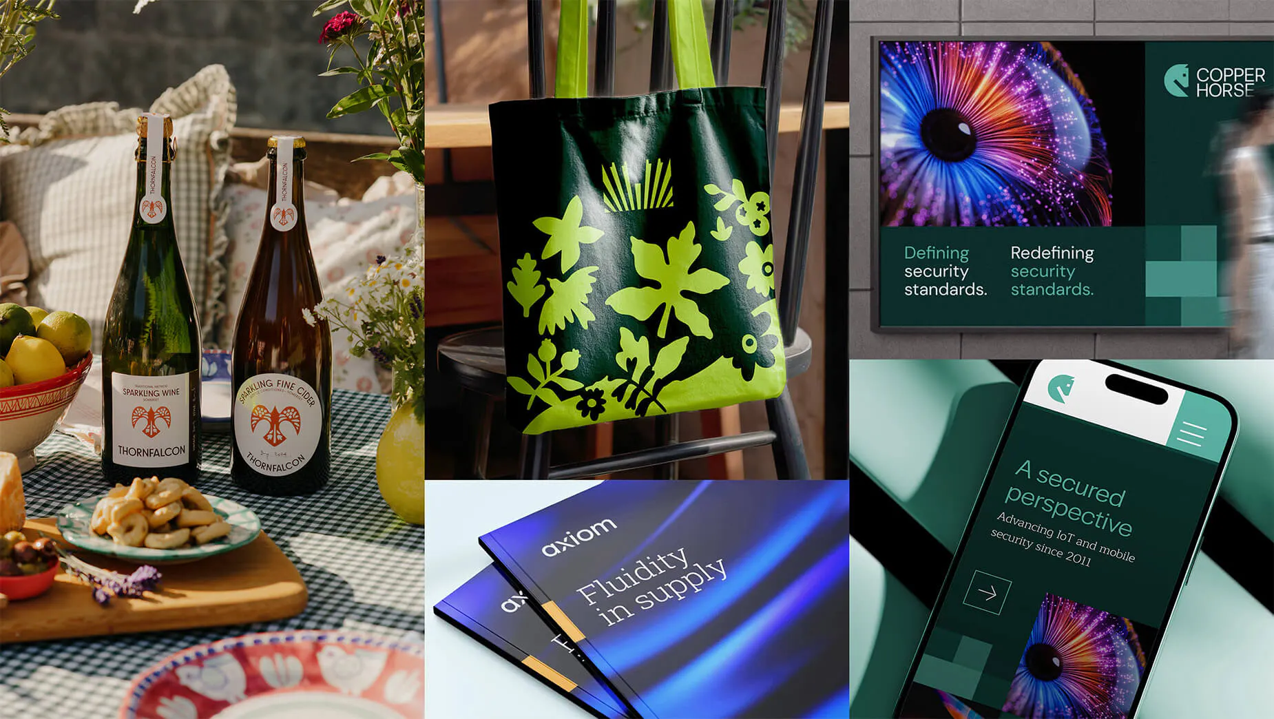
ABOVE: (L–R): Thornfalcon, Cyfarthfa, Axiom, Copper Horse
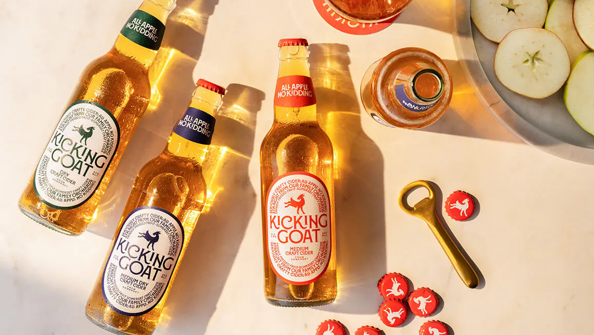
Kicking Goat’s ‘Dolce Vita Cider’ never appears in print or on an ad, but it sets the positional and spiritual tone for the brand. Every choice, from typography, to label design to art direction, all came from that positioning line and work together to create an imaginary world of Panama hats, a good book, no particular place to be, and the sun-kissed Riviera good life, rejecting every typical cider cue possible. It stops short of simply slapping the word ‘premium’ everywhere and carves a story that does that job in another way. And it worked. By staying true to their positioning, The Goat is now the fastest-growing craft cider brand in the UK.
Our work with the Cardiff Devils also shows just how much this can matter. With a passionate, vocal and fiercely loyal following, the club needed a big brand update that could honour its history while looking confidently to the future and growing a fan base. After more than 25 years without a major rebrand, the challenge wasn’t simply to create a new logo. It was to capture the club’s character, ambition and distinctive place in the world of sport.
The brand needed to, as literally as possible, shake feathers and raise merry hell, a mirror to the cauldron-like atmosphere in the rink when voices are up and the team is firing. That thinking shaped the new visual identity and extended into a wider digital strategy. Every element needed to work harder for the club, from expressing its personality to helping fans find fixtures, buy tickets and engage with the team.
The result was a brand equipped for a new chapter, while remaining connected to the qualities that made it special in the first place. We knew the change would be controversial too, so there’s a little wry, tongue-in-cheek humour, but the brand wrapped around the two simple words Raise Hell, which provided a launchpad to an attitudinal spirit. From the music in the rink to the tone of voice in comms and the design of the extended merch line. LFG. And the results? Weekly match sell-outs and Y-O-Y merch sales up through the roof.
It’s about the meaning people recognise in it, the attitude it conveys and the experience that reinforces both over time.

So how could we use the same thinking to approach your rebrand?
Strip away dead petals and reestablish the roots. If your brand feels forgettable or confused despite best efforts, it might not be a creative problem. It might be a positioning problem. Before we start, we ask three questions:
What do you want to be famous for? Identify the one clear idea you want people to associate with your brand, and double down. Not a list of values or a collection of adjectives, but a meaningful point of difference that matters to your audience.
How can you consistently prove it? Look beyond your messaging. Do your identity, website, socials, customer experience and every other touchpoint reinforce that idea? Does the reality of your business live up to the promise your brand makes, and do you present that consistently?
What do people associate you with, unprompte? The real test is whether your audience makes the connection naturally, without needing to be told what to think. What you think you are and what your customer thinks you are could be misaligned.
If the answers aren’t clear, there’s work to do beneath the surface. That means defining what makes your brand different, or unearthing it and understanding the value you bring to your audience, translating that into a consistent experience. It’s strategic work, and it takes time and care.
Your tagline can change. Your positioning needs consistency. Markets change. Businesses grow. Priorities shift. Creative expressions move on so a line that worked five years ago might not be the right fit for your brand today. But constantly changing what your brand stands for is an entirely different kettle of fish.
Strong positioning gives your brand a clear foundation to grow from. It allows your messaging and identity to evolve without losing the underlying idea that makes you recognisable. Our work with Codi Group shows how a strategic idea can help unite an organisation around a shared purpose.
Formed through the merger of Linc Cymru and Pobl Group, Codi Group needed a brand that could bring the scale of a major housing group together with a genuinely local, human approach. The mission is to lift people and life chances, raising standards, building opportunity and creating places and communities that feel like home. From there came the name Codi – Welsh for to rise – every brand choice stems from there.
From naming and brand strategy through to visual identity and launch, that central idea helped articulate a renewed sense of purpose, grounded in Welsh heritage and a desire to make a lasting local impact at scale.
It wasn’t about finding a line to put beneath a logo. It was about establishing an idea that could connect the organisation’s purpose with how it presents itself to customers, staff, partners and stakeholders. The idea came before the name, which in turn preceded the visual brand. That’s the real value of positioning. It gives a brand something meaningful to build on, a reason for being and a north star, even as the business grows and changes.
The strongest brands do more than say something. They stand for something. At Limegreentangerine, our approach to brand strategy and design starts with listening, learning and uncovering what makes each business different. From there, we build the strategic foundation and creative tools to express that difference consistently, across brand identity, digital and every other customer touchpoint.
Because a brand isn’t just a logo, a tagline or a set of guidelines. It’s how it all weaves together to guide the impression people carry. That impression builds over time, through everything your business says and does. The flower might get the attention, but it’s the roots that make your brand last.
“The experience has been fantastic from start to finish. The creative workshop was such a highlight; it brought our team together in an engaging way, sparking ideas we didn’t even know we had. LGT were full of amazing ideas. They managed to capture exactly what we didn’t even realise we wanted, creating a new name, logo, look, and voice that feels true to us and that our whole team is excited about.” — Leanne Yau, Kora HR (formerly Highfield HR)
Have a brand that needs to stand apart? Let’s have a chat.